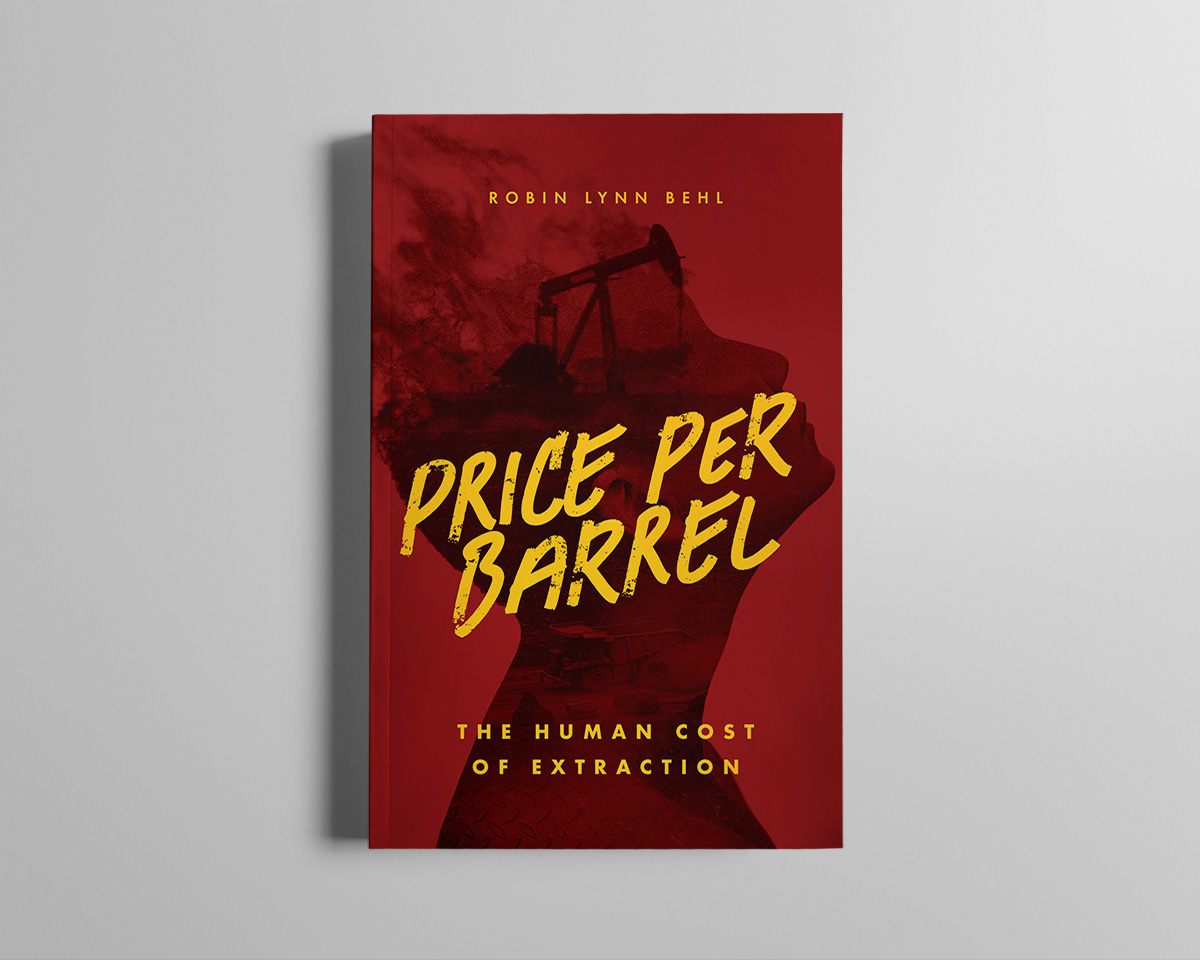
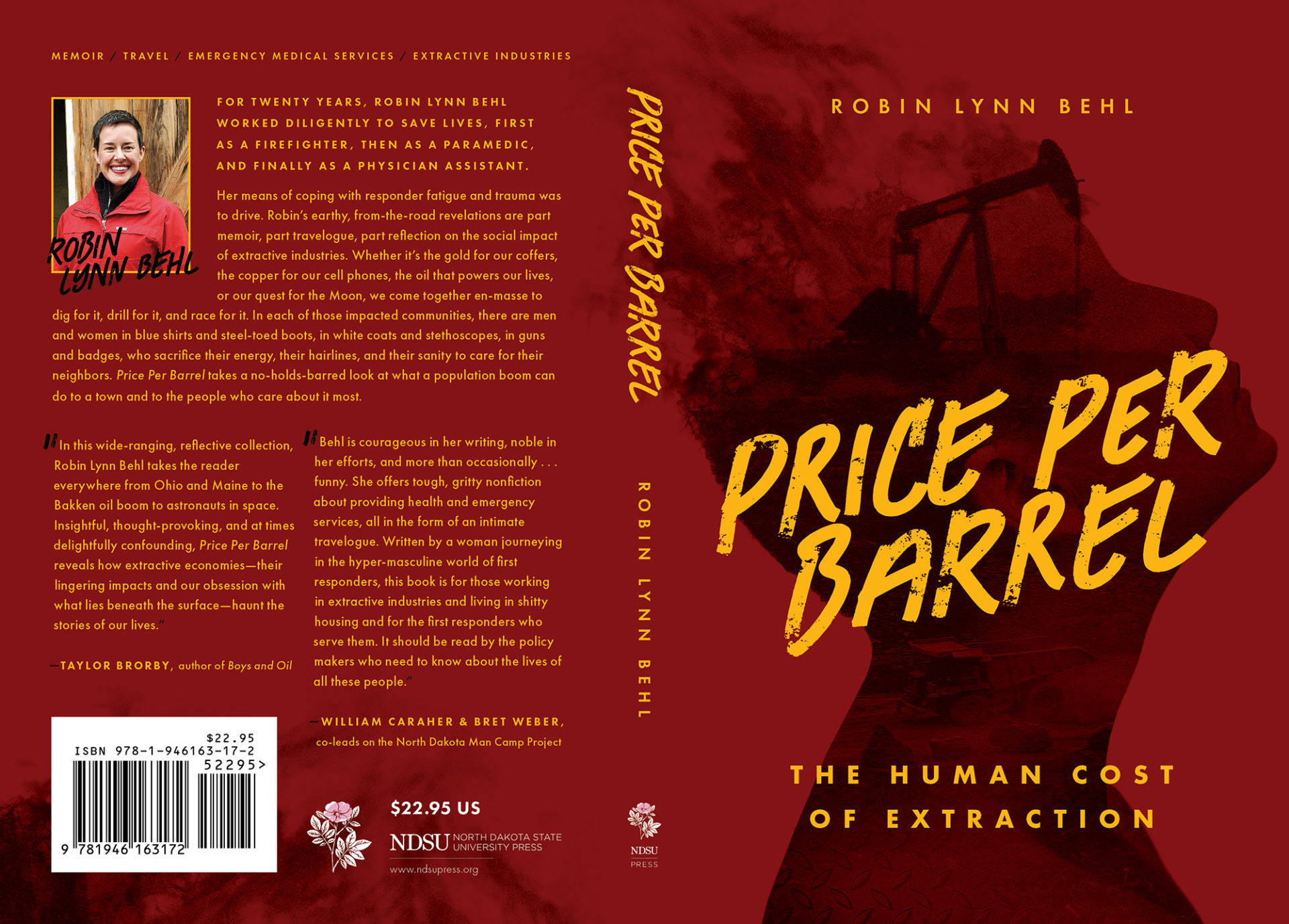
From the editor, “This book has grit, heart, survival…and a strong woman who traversed all these roads on her own.” The creative brief highlighted gritty imagery like oil fields and heavy machinery contrasted with human elements like EMTs, firefighters, and the author’s own presence. To incorporate these elements, I used a double exposure effect with a collage of images blended into a silhouette resembling the author herself.
Robin Lynn Behl’s unique voice and writing style inspired my design choices for the title font—with an off-kilter angle, rough brushstrokes, and intense yellow contrast. The color palette was inspired by emergency service vehicles, and even uses a firetruck red color swatch provided by the author.